How to Make a Stellar Academic Poster
Research Ambassador Blog Post By: Lauren Okano
Picture this. You have just completed a research project on your dream research topic, and you can’t wait to share your findings. What do you do? Well, you have come to the right place because this post is all about one of the key players in research dissemination: the academic poster.
What is an academic poster?
Academic posters are one-page displays that provide an overview of your research project to an audience. In most cases, posters are presented at research conferences to other academics in a related field. The main goal of academic posters is to clearly and concisely deliver information about your research to your audience.
When designing your poster, you should always keep one guiding principle in mind:
“What do I want my audience to take-away from my poster?”
This will help you organize your information in a way that emphasizes key points. Poster design is also important for adding the extra “wow factor” that appeals to your audience.
Where do I start?
The planning stages of making an academic poster are important as they will help give you a roadmap to follow down the road.
Here are a few tips for starting places when planning your design:
Do a quick Google search
- Check out google images for design ideas using keywords like ‘academic posters’, or ‘research posters’.
- Make note of designs that grab your attention
Check conference guidelines
- Some conferences will have specific guidelines for poster formatting
- Check out your conference website & make note of any specifications
Choose your design software
- Choose a platform that allows you to edit and design freely
- Microsoft PowerPoint is a great user-friendly option
Size and General Layout
There are several key features of an academic poster that you should keep in mind when getting started.
Document Sizing
Choosing the right size format is one of the first things to establish when designing your poster. The most common size for a printed poster is 36’ x 48’ (91.44 cm x 121.92 cm). You can set this parameter in PowerPoint by clicking on the ‘Design’ tab. Then select ‘Slide size”, “Page Setup”, and enter your desired dimensions.

Font Style & Size
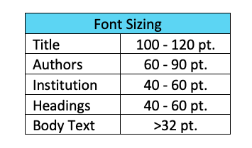
Your poster should have text that is readable from a distance. The title should also be large enough to grab the attention of audience from afar. Font styles should be simple and easy to read. Here are some guidelines for font size:

Other Layout Components
- An engaging title
- Contributing authors
- Name of your institution/logo
- Poster body divided into 3-4 columns
- Section Headings (e.g., Background, Methodology, Results, Discussion, Conclusion…)
- Acknowledgements
- References
FAQ: How much text should I have?
Academic posters should have enough text to deliver the main findings of your research without overwhelming your audience. Try sticking to point form explanations and avoid using long paragraphs. A great way to balance out your poster is to use visuals such as images, figures, tables, and flowcharts. Aim for 300 to 800 words on your poster.
Picking a Color Scheme
Now for the fun part! Try browsing the color themes under the ‘Design’ tab in PowerPoint for some inspiration. Feel free to be creative when choosing a color scheme that best-suits your poster.
Consider these extra tips:
- Use high contrasting colors
- Contrasting the color of text-to-background will help with readability
- Be ‘color-blind’ friendly
- Make sure color is distinguishable to all audience members
- Do a quick Google Search to find color-blind friendly palettes
- Take advantage of color to ‘highlight’ your key points
Backgrounds
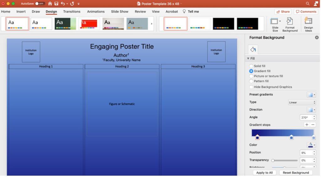
Once you decide on a color-scheme, you can set your background color for your poster. You can easily do so by clicking on the “Design” tab in PowerPoint, followed by the “Format Background” button. Here you can customize your background by selecting color along with “solid”, “gradient”, “picture”, or “pattern” fill options.

Graphics & Visuals
Visuals are a great way to summarize important information for your audience. Visual can come in many forms including images, flowcharts, graphs, & tables. You can design your own visuals to add a unique flair to your poster.
Check out the following websites that will help you accomplish this:
You can also use ready-made visuals to highlight key concepts. Make sure to cite your sources or take them from sites with Creative Commons licenses that allow you to use them for free.
Try some of these sites for your images:
Referencing
It is crucial that you cite your sources on an academic poster. Be sure to adhere to the citation style guidelines in your field of study. A list of common style guides can be found on the TRU library website.
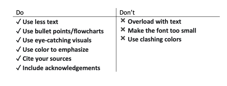
To summarize, here is a quick overview of academic poster Dos & Don’ts:

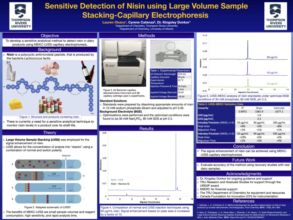
Here is an example of my academic poster for a research conference in chemistry:

And there you have it! You are now one step further down the dissemination path in your research journey. Best of luck creating your academic poster!
References:
Brock University Library. (2021, Jun 14). How to Create a Research Poster. https://researchguides.library.brocku.ca/poster#s-lg-box-1921964
Centennial College Libraries. (2021, Aug 30). Digital Scholarship Lab: Academic Posters. https://libraryguides.centennialcollege.ca/DSL/posters
Thompson Rivers University Library. (2021, Apr 9). Creating an Academic Poster: Tips and Tricks. https://libguides.tru.ca/academicposters/size

